
The goal of your website is to persuade potential customers and to target the ideal customers who would benefit from your services. If your website is not a client convincing machine, what’s the point of having one?
Having a great website is essential because it allows you to market your business online. It makes it easy for people to find you and know more about your company, what you do and what products and services you can offer. Your website should not only look pretty but should also provide helpful information to the audience.
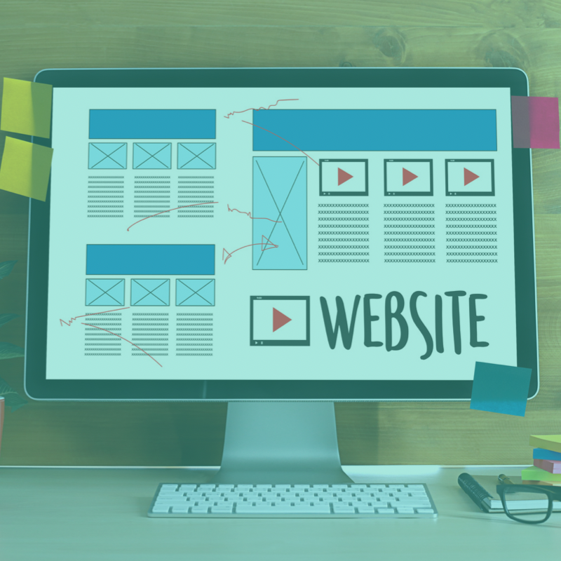
There are numerous elements to consider when creating the ideal website. If you’re intending to create a website for your company or want to update your existing website, read this list first to avoid making and repeating these common mistakes that ruin a website.
1. Dull, unprofessional, and outdated web design
Your website’s design speaks a lot for your business. No matter what happens, it must create a great and professional impression on clients. Therefore, if your web designs are outdated, clients could associate this with an old-fashioned practice, style, product, or service.
First impression matters, you need to position yourself as someone who is professional and trustworthy. You can achieve this by spicing up your web design, and choosing fresh and inspiring colors. You should choose visually appealing colors and a modern aesthetic design.
2. Missing target audience
It is essential to identify first who your ideal clients are, what they want and what they need. You should make sure that your website has the look and “”feels” that caters to your target audience.
Try benchmarking, check out other websites owned by companies that have the same business like you. Checking out your competitor’s website can give you ideas that can help you create a better website.
3. Overloaded website content
Your website should provide enough information that is easy for the people to understand. It should have an easy navigation wherein the visitors can easily click it and access. It should not be crammed and overloaded that may cause confusion.
Crowded website is never a good thing. Websites with too much detail, colors, text and so much going can cause the pages to load slowly. Always remember that people have little patience so that’s why your website should have easy access.
4. Unattractive, pixelated, and unprofessional looking images
It is important for potential clients to understand what your business is. Using pictures is the best way to go. So, if you are using old photos and not professionally taken photos in your website, it is time to change that.
The images on your website should be friendly, warm, and welcoming. Showcase the beauty of your company’s reception area, office, and products. Provide pictures of your highly satisfied happy customers.
5. Unavailable contact details
Contact details should be seen at the top of your website. Your clients should be able to know your full contacts when they visit your website. Your phone number and business address should be the most accessible part of your website.
You can also put a ‘Contact Us’ section or page. An alternative could be placing these on the footer of each page.
6. Clients can’t communicate and connect easily
Communication is vital. Clients should be able to contact and communicate with you easily.
Make sure that your clients can easily message you through your website. Keep your lines open and make your replies simple and easy to understand. Speak to a client as if they are experiencing your services for the first time. A website that has good communication features shows that your company is easy to reach and capable of providing great customer service.
7. ‘Call Now’ or ‘Book Now’ buttons are not working or unavailable
It is very important that all buttons on your website are working, especially this one. Clients will certainly look for other websites if they can’t get in touch with you easily.
Having a cloud-based booking is a big help. This will allow your potential clients to search and reach you in a jiff.
8. The website isn’t mobile-ready
Approximately 70% of service-based searches are done through mobile phones. If your website cannot function properly or is not designed for mobile use, your potential client will less likely spend time figuring your website out.
Here are some tips for mobile designs:
- Always keep the menu bar accessible.
- Have a clear call-to-actions (CTAs) on the website.
- Minimize texts to keep clients from scrolling endlessly.
- Make sure the font sizes are just right.
Most websites are now designed for mobile frames. If you’re not doing this yet, you definitely should.
9. Call-to-Actions (CTAs) are unavailable
Call-to-actions are short statements on your website. It prompts the client to take an action or to click something. If this is not present, clients might choose to look for other websites.
Examples are “Book online now!”, or “Click here for a quotation”. Your aim is to get people to take immediate action and trust your business.
10. Broken links are everywhere
Broken links are quite frustrating. It shows that the website is mismanaged, not unmaintained.This will give your potential clients a bad impression on your website.
So, check all your links, go into your client’s shoes, as if you are a client visiting the website for the first time. Make sure that everything is in order and in place. An organized and well kept website is a great website.
11. The website is slow
Google found out that 70% of the websites they have studied and surveyed took 7 seconds or longer to load. If your website is one of these, you might be in big trouble.
Most users do not have enough patience in waiting for a website to load. Optimize your website speed and make sure that it loads within 2-3 seconds.
12. Hard to read content
Potential clients who visit your website read only 28% of the text. Does this mean you have to reduce your content? Not really.
Here are some tips to make your content scannable and easy to read:
- Use descriptive subheadings
- Write short paragraphs with two or three sentences
- Use a bulleted and numbered list.
- Highlight, italicize, and bold important words or phrases.
If you use this kind of format, clients will most likely read your content. Also, this guarantees that their visit is worthwhile and helpful.
13. The links do not open into a separate tab
When inserting links, be sure that they open in a separate tab. This will prevent your clients from leaving your website.
If links do not open in separate tabs, it increases the number of clients who leave your website. This will negatively affect your bounce rate and you will have more problems with SEO.
14. The website doesn’t live up to the client’s expectations
If your website has a wonderful picture of your beautiful reception or an eye-pleasing product, it should look the same when clients see them in person. Clients get disappointed if their expectations are not set. Make sure to provide products that can cause people to make good reviews.
Clients should see and experience your good service both through your website and in person. Consistency is the key element to success.
15. The website has no product or service reviews
88% of consumers trust online reviews, they treat it as if they’re personal recommendations from a friend. Reviews are essential to a client’s decision-making process.
Good reviews are very important, and your website should definitely have one. If you already have experiences and testimonials, be sure to put that in!
Now what?
Websites can attract customers and increase your company’s sales and revenue. Having a great website is a must. Use the tips above as a guideline to create or modify your website or contact us!
Shark Jockey Digital can help you create the best unique website that your business needs. Consult with us today!

Nick is the owner of Shark Jockey Digital and 20 year veteran in the marketing industry. He currently helps clients with development projects, lead generation, website creation, SEO, SEM, PPC, social media marketing, Google reviews, online listing, and campaign management.